By Marta Vallejo, Newswire Intern
Cincinnati’s oldest and family-owned ice cream chain, Graeter’s, has recently undergone a rebranding. After more than 150 years of serving up its signature French pot ice cream, the company has unveiled a new, modernized logo and packaging.
Graeter’s ice cream was founded back in 1870 by Louis C. Graeter and has remained a family-owned brand for over a century. Though the company was created in Cincinnati, it has managed to expand to grocery stores all across the country. Graeter’s is widely known for its French pot ice cream, made by churning ice cream two gallons at a time to create a dense, creamy texture.

Graeters announced a rebranding, changing its logo alongside the slogan, “Taste the Greatest.”
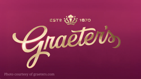
The rebrand last week introduced a new logo and packaging that simplify the classic design. The familiar font remains but with a cleaner look. Graeter’s has also brought in a deep magenta hue and a crown icon with a small ice cream cone into the mix. On top of that, the company changed the words in the logo from “Since 1870” to “Estd. 1870.” Graeter’s new tagline has changed as well, becoming: “Taste the Greatest.”
These new brand designs were created in collaboration with design firm Dewhaus. Graeter’s calls its rebrand “refined” and said that this new color palette is actually a return to their signature maroon color. They mentioned the crown icon included in the new logo is intended to honor Cincinnati as the Queen City.
This rebrand is most likely looking to reinvent Graeter’s image and appeal to a new generation — while keeping its rich history alive.
“I like it. I think it’s cool that they kept the same font, and I like the new color better,” first-year Digital Innovation, Film and Television major Tatiana Fasnacht said.
Some students have found this rebrand effective and have had a positive reaction. Others have shared different opinions on the updated designs.
“I don’t like it. I like the old original one. It’s got more of an old fashioned feel to it, instead of the new one,” first-year nursing major Grace Gabriel said.
And lastly, other students have found themselves somewhere in the middle, appreciating some factors of Graeter’s rebranding while also reminiscing on the original design.
“I like the new logo but it’s not as classic as the old. I am glad that they kept the font basically the same so it didn’t lose its touch,” first-year Philosophy, Politics and the Public major Emily Simpson said.
Graeter’s ice cream has always served up delicious, fresh and high quality products over its long duration. However, Graeter’s continues to evolve without forgetting its roots. The new look might be different, but the company’s commitment to small-batch ice cream and to the city that made it famous remains the same.

